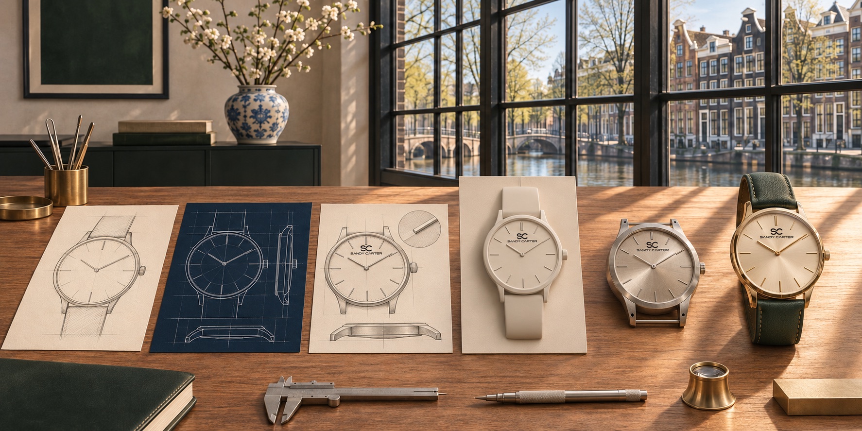
Begin with a coherent design
A premium watch should feel resolved. The dial, case, crown, hands, markers and strap need to relate as one composition. Expensive-looking decoration cannot compensate for poor proportion or confusing legibility. Strong design often appears simple because unnecessary decisions have been removed.
Look closely at spacing and alignment. Are the markers balanced? Does the date window interrupt the dial or feel integrated? Does the case size suit the dial opening? These details reveal whether a watch was considered as a whole.
Demand verified information
Materials, movement, glass, water resistance, dimensions, product origin and warranty should be stated clearly. Words such as “luxury” and “premium” are positioning terms; they are not technical specifications. A responsible product page makes it easy to separate design language from measurable facts.
Consider finishing and long-term wear
Finishing affects how light moves across a case and bracelet. Brushed, polished and textured surfaces can add character when they support the design. Comfort also matters: case thickness, lug shape, bracelet articulation and strap flexibility influence whether a watch remains enjoyable after several hours.
Evaluate the complete customer experience
A premium purchase includes more than the object. Clear shipping, returns, warranty and support information reduce uncertainty. Authentic product photography should show multiple angles rather than hide important details.
SANDY D. CARTER will publish these facts model by model before orders open. Until then, collection imagery remains a design preview rather than a catalogue of products available for sale.