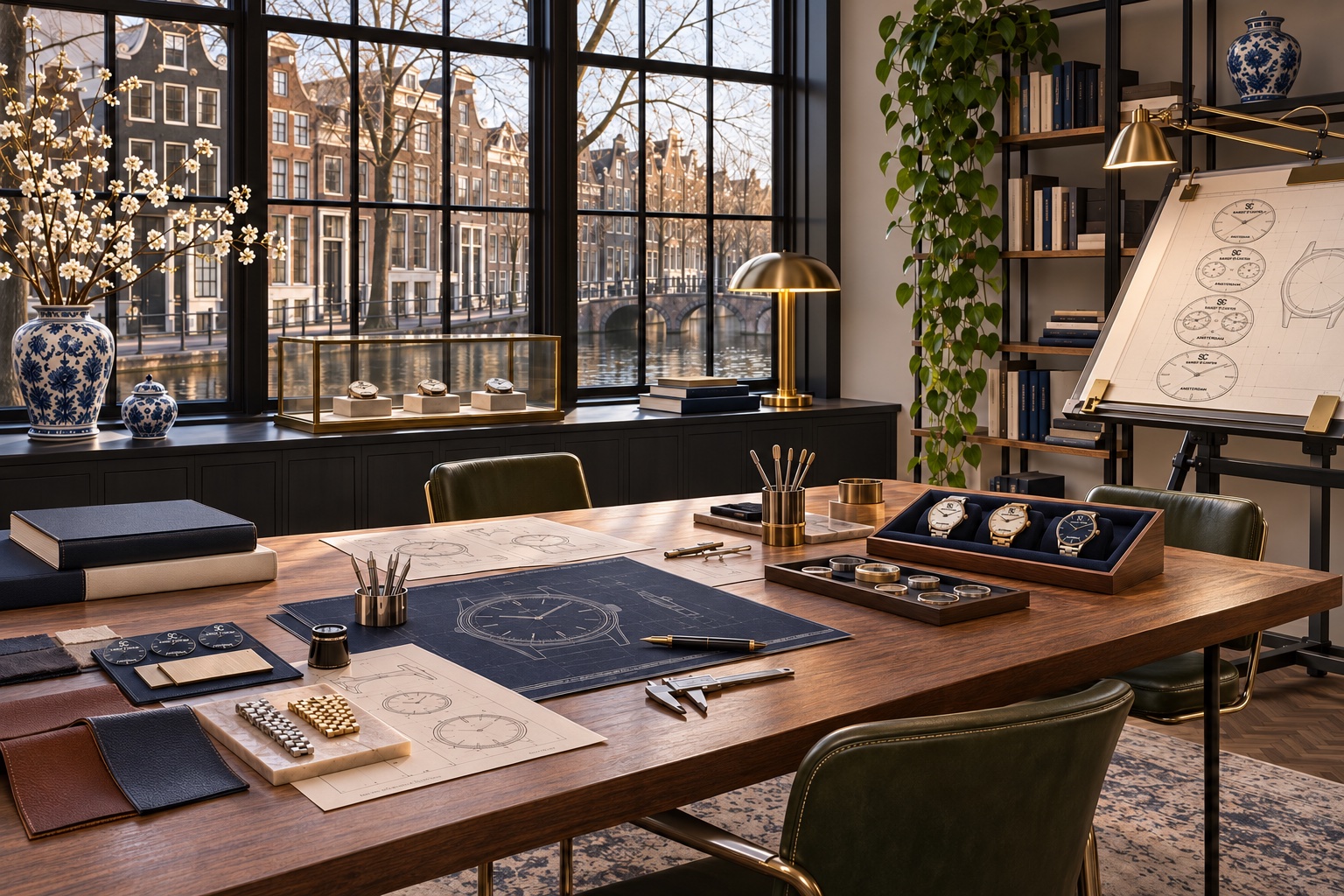
Inspiration
Architectural lines, light, colour and material references establish an emotional and visual direction.
The design studio
The collection starts with proportion and use, then moves into material, colour and finishing decisions.
TIME REFINED
The relationship between dial, case and strap sets the character of a watch. We consider how that balance reads at a glance and how the case will sit on a wrist.
A colour or surface is considered as part of the complete watch. The aim is a coherent design that works with everyday clothes, rather than a collection of decorative additions.
Architectural lines, light, colour and material references establish an emotional and visual direction.
Quick studies explore silhouette, dial hierarchy and the relationship between case, crown and strap.
Markers, hands, negative space and information are tested as a system rather than isolated details.
Scale, spacing and legibility are refined so the official identity sits naturally within the composition.
Two-dimensional drawings are assessed for balance, then reconsidered in relation to three-dimensional form and wear.
Colour and surface references test mood and contrast. They do not announce an unverified production material.
Ideas are edited repeatedly. What does not improve clarity, function or character is removed.